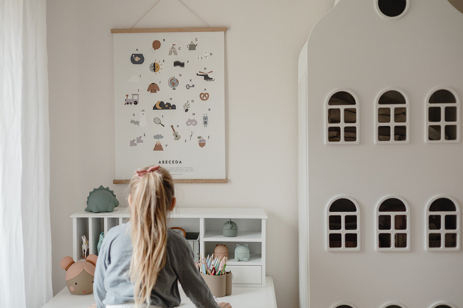
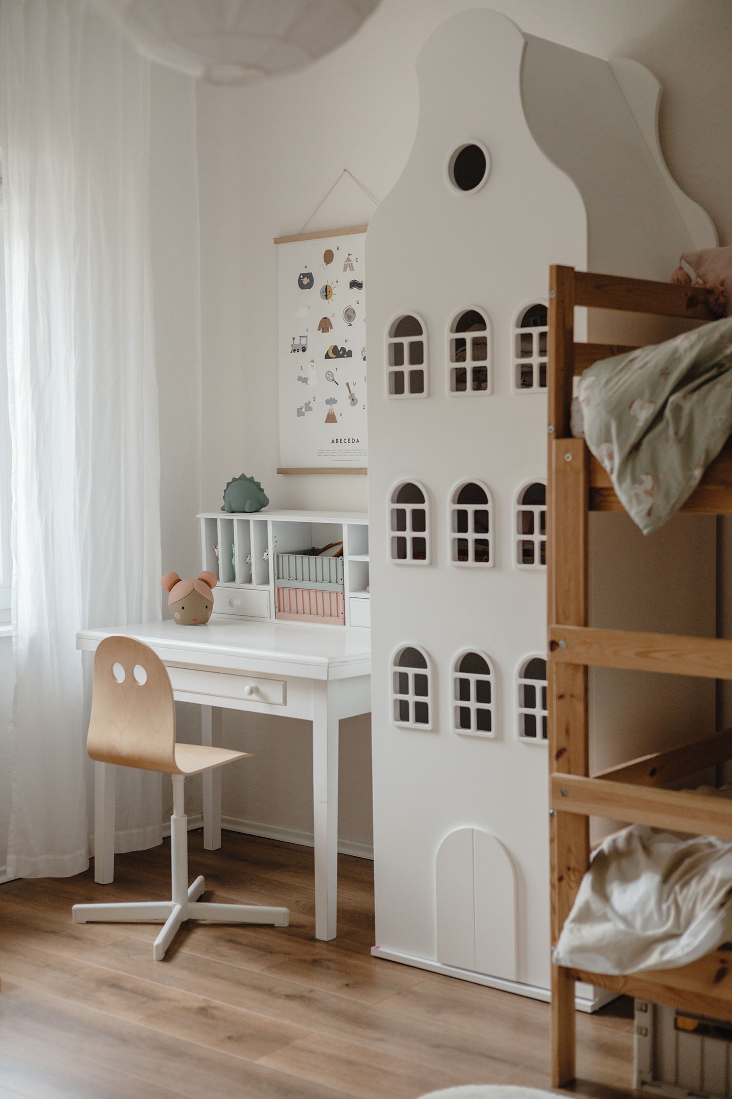
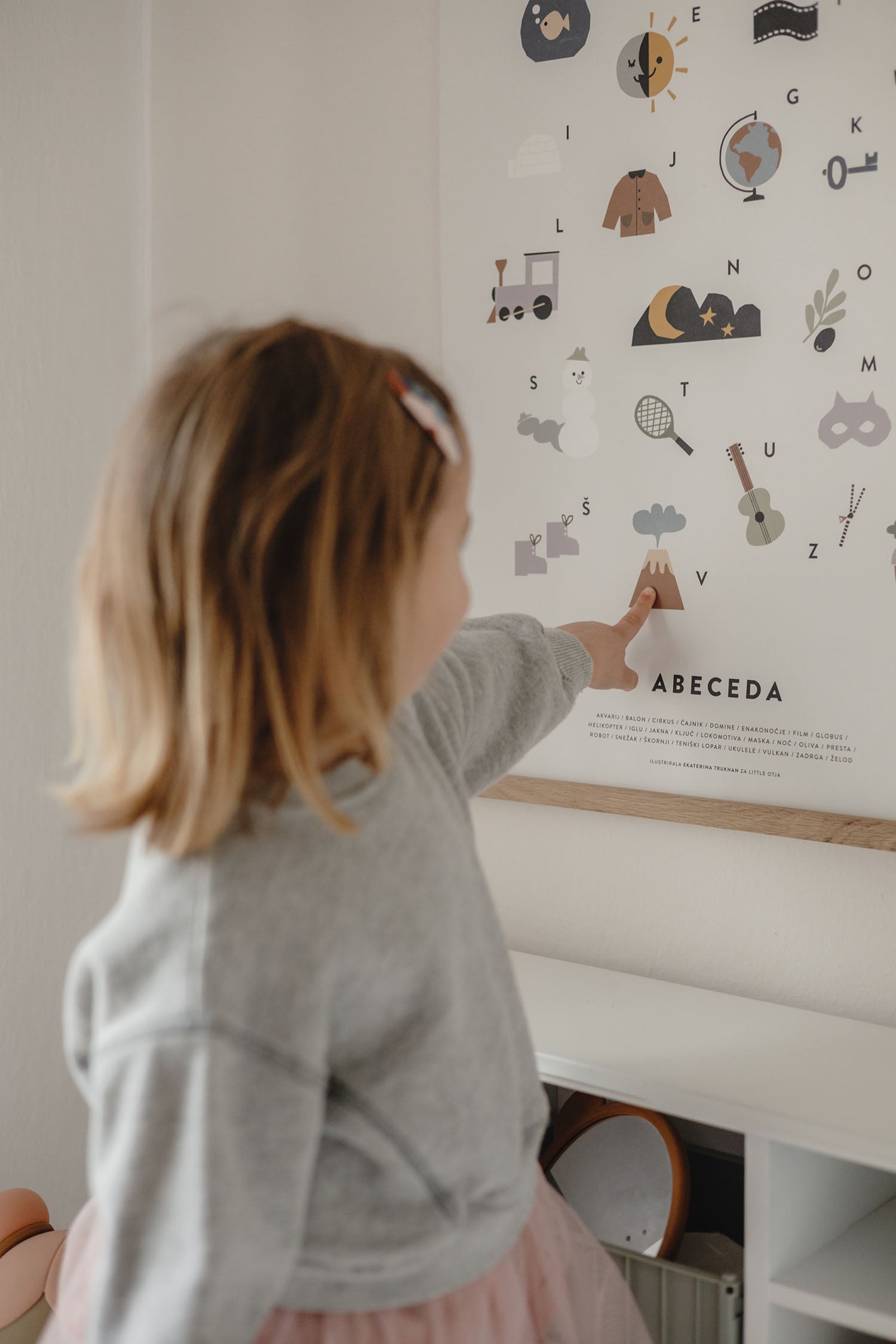
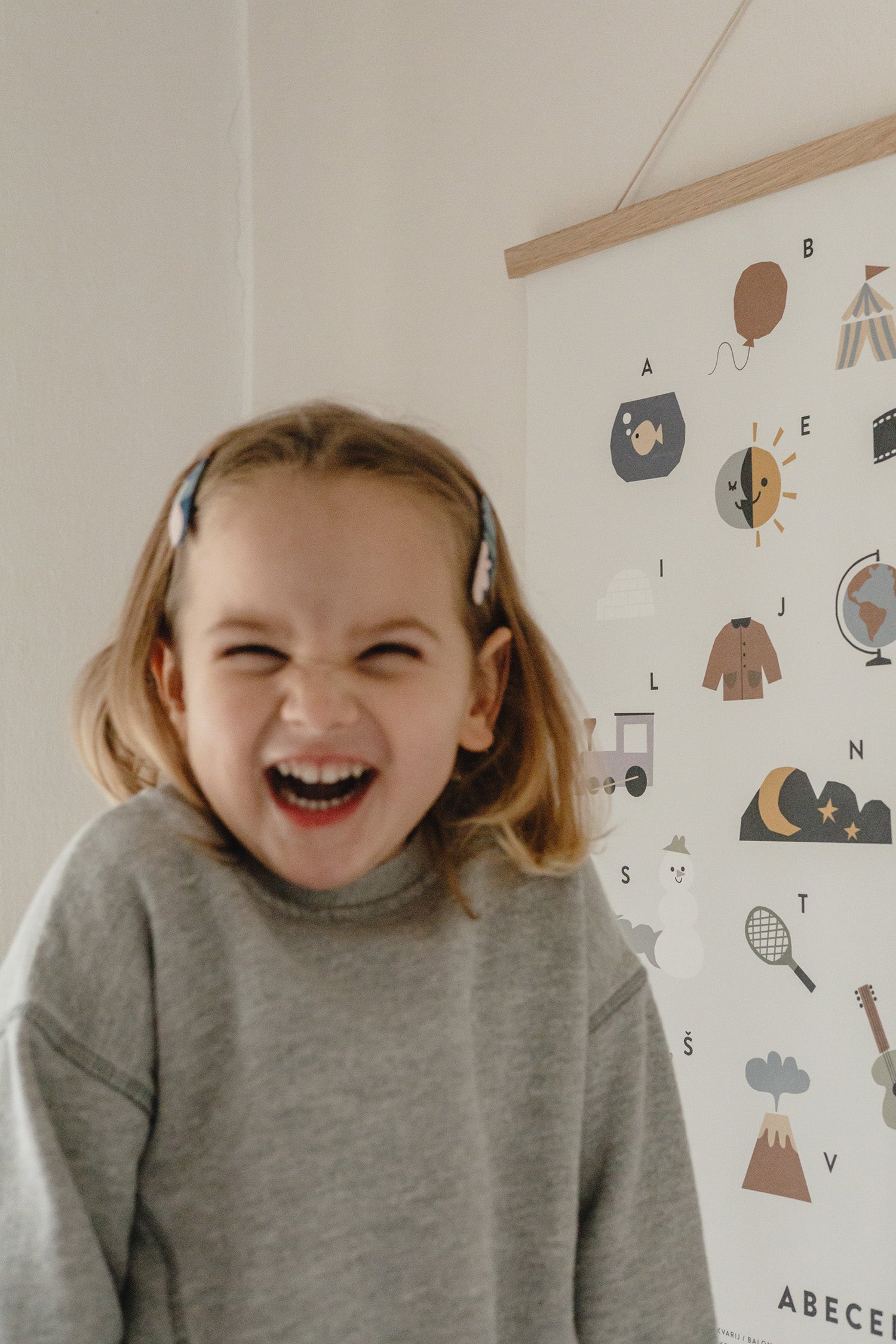
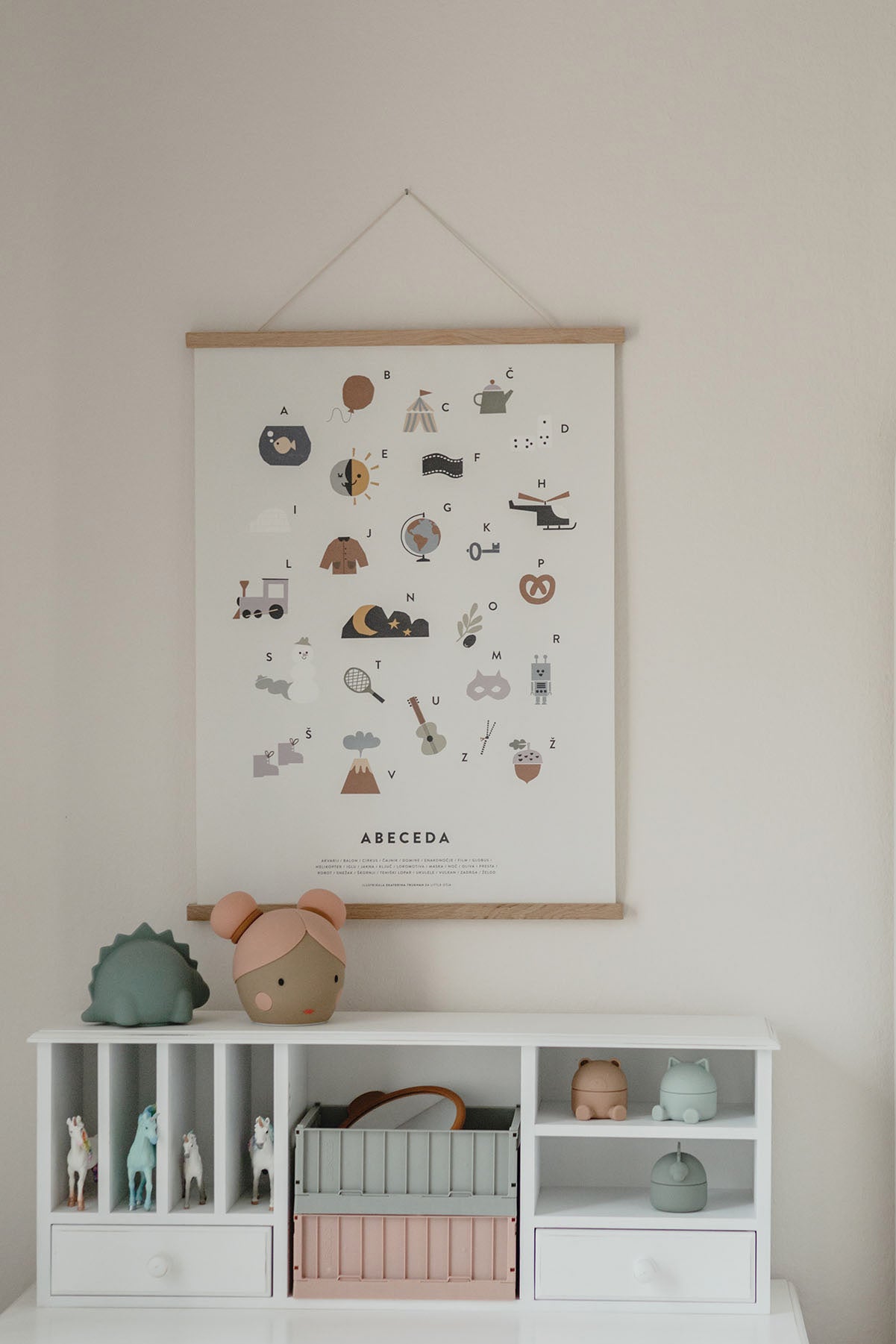
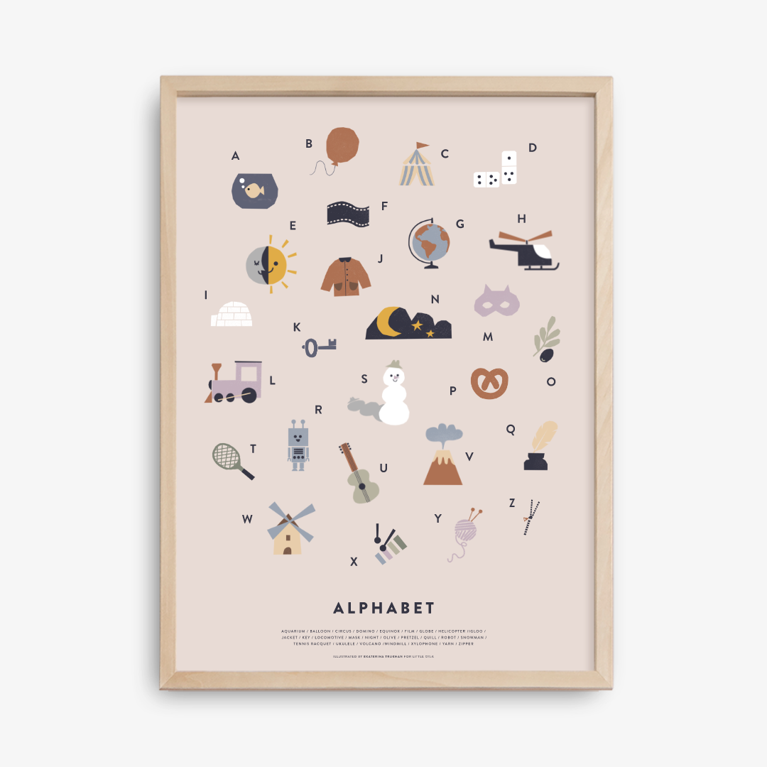
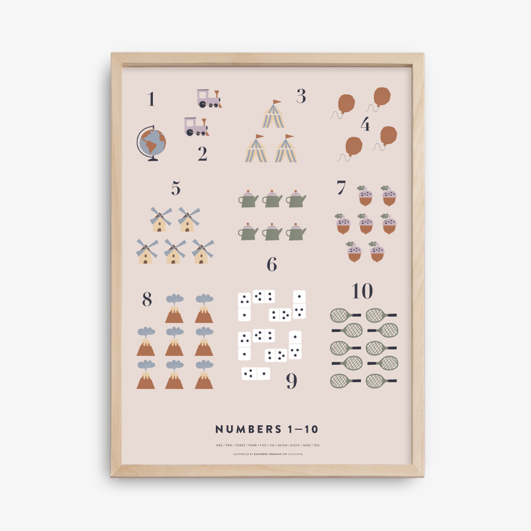
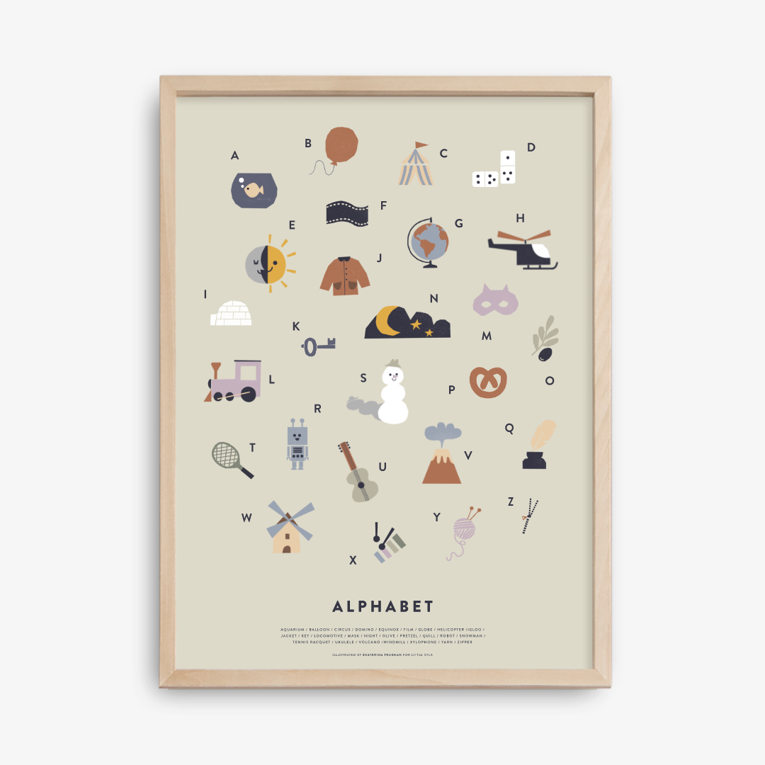
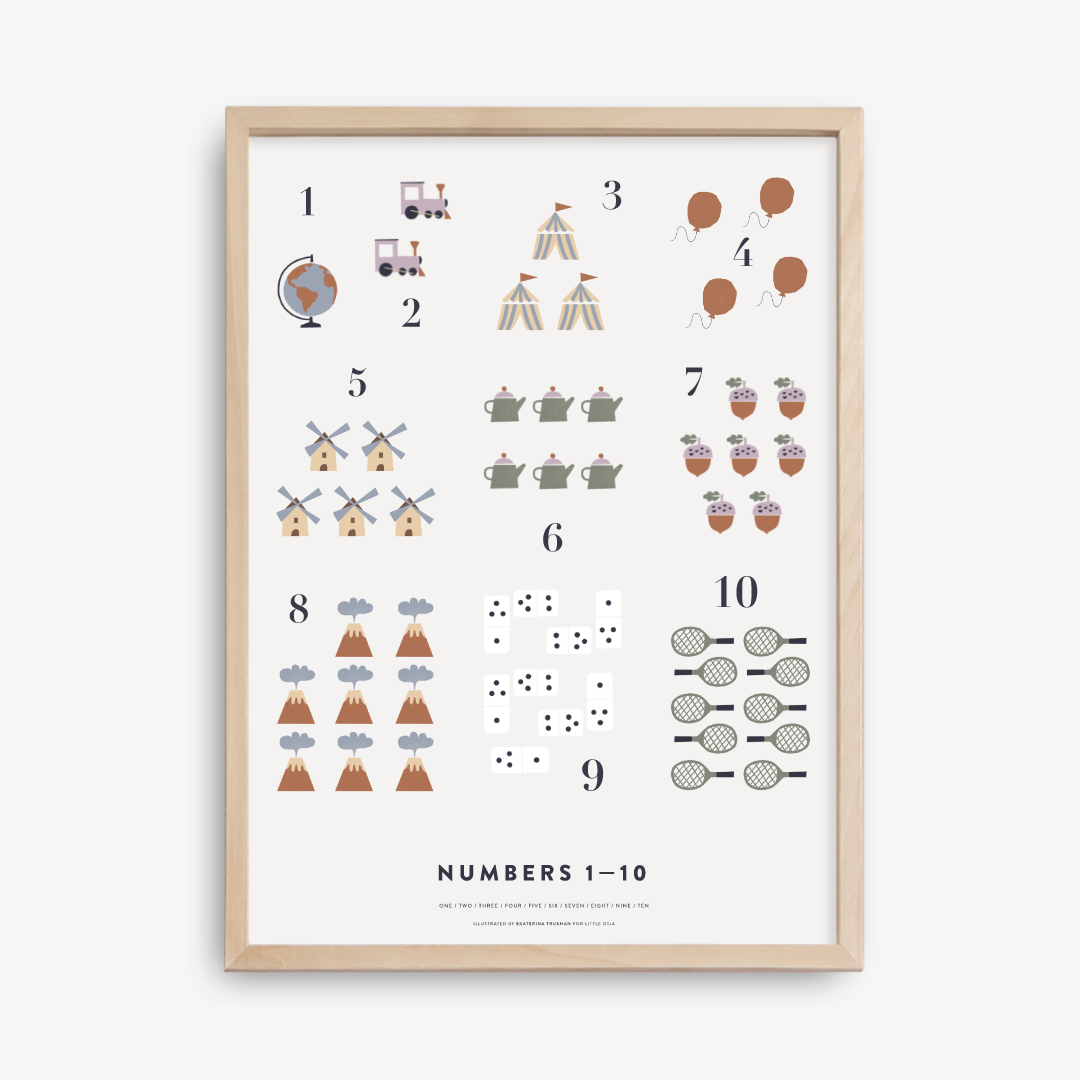
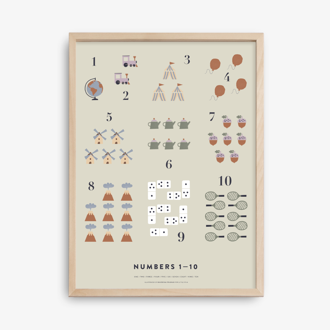
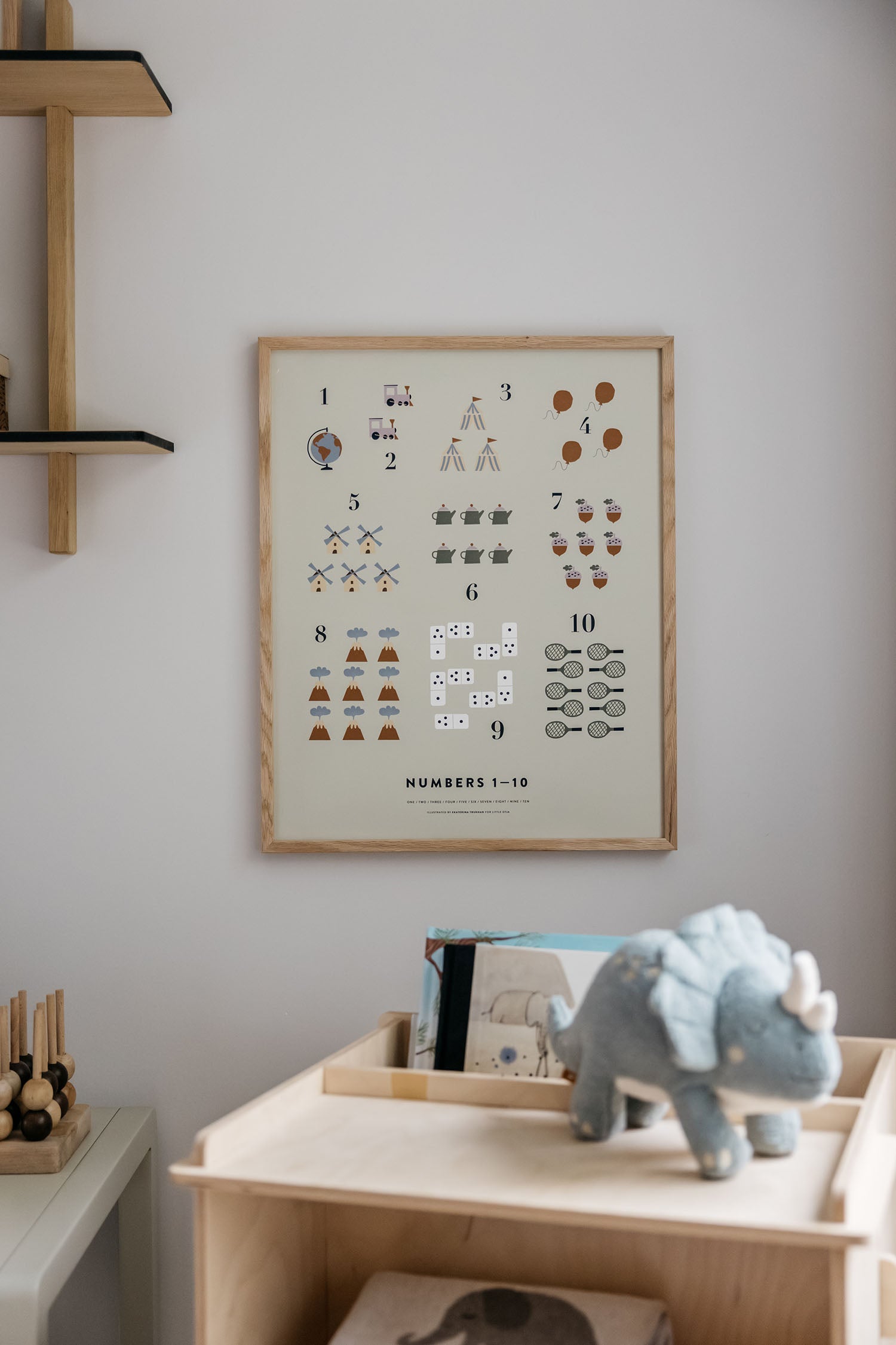
The background of the poster comes in three variants: light gray, soft pink or green. And I believe that the right choice can blend in beautifully with the furniture and decoration of any child's room. The alphabet goes really well also with the 123 poster, which was also created with the above-mentioned illustrator.
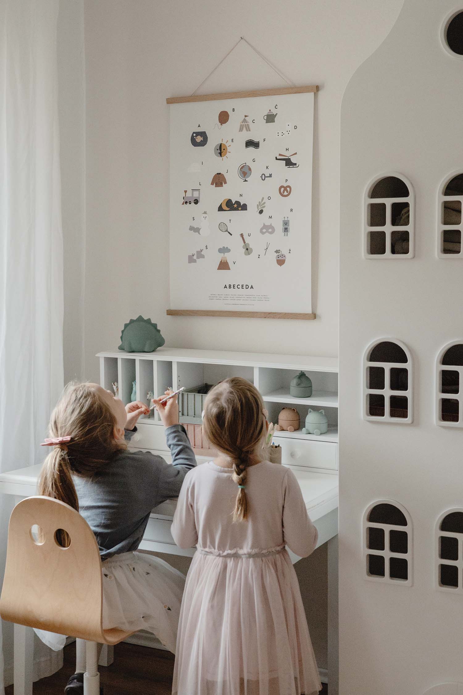
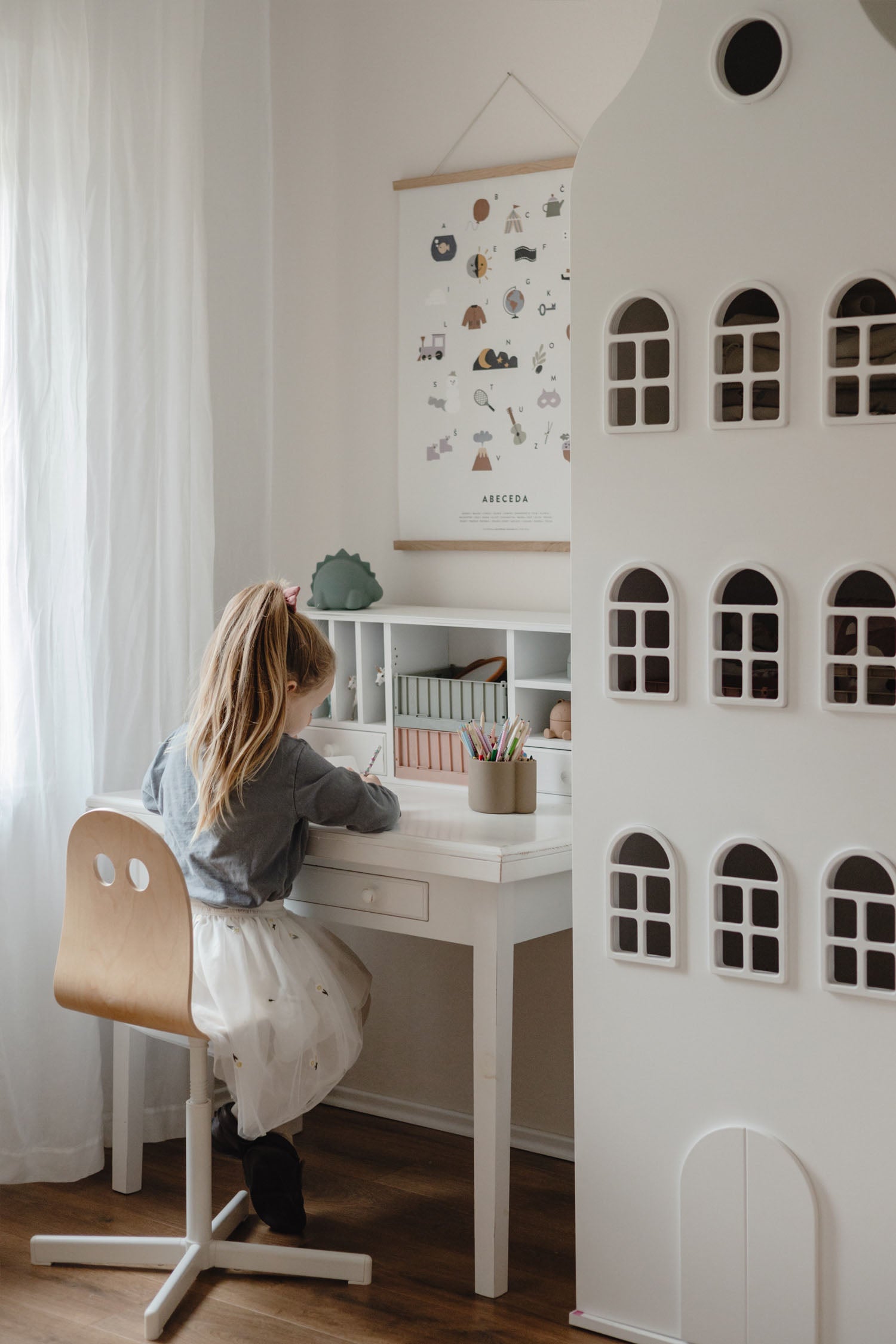
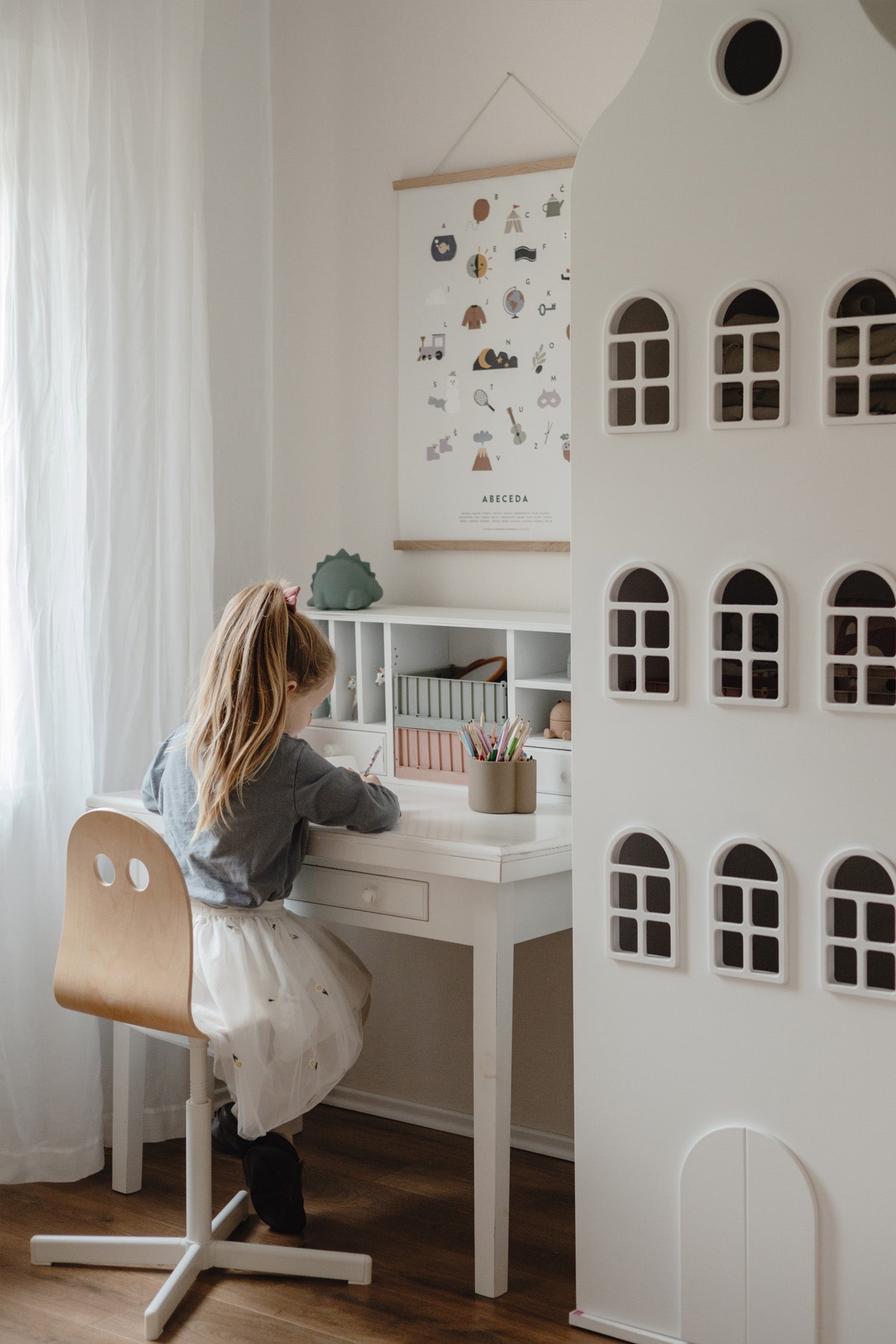
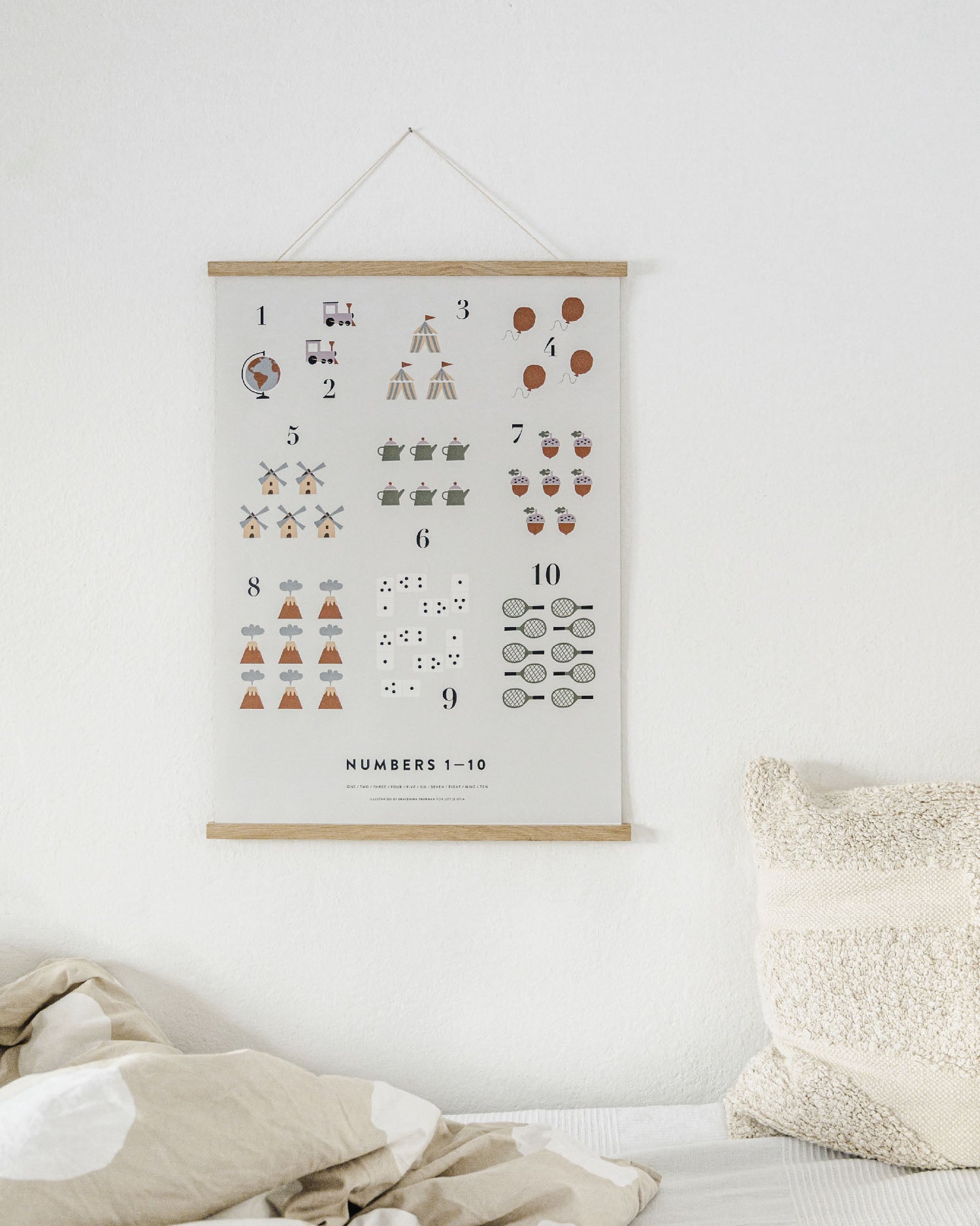
I decided for a light gray background in the biggest format available (50x70 cm) and I am so happy with my choice. Instead of the usual frame, I decided to try out the oak picture hanger with magnets. They're available also in white and black. I'm really satisfied because it seems that I managed to create such a pleasant, but at the same time slightly school-like atmosphere in one corner of the room, which in addition reminds to my first grade classroom. This made me a little nostalgic and I thought about how we spend time with our children and how it goes by too quickly.
There's one important thing I'd like to point out at the end. When buying artwork for your home you should remember that bigger is definitely better and this poster definitely stands out in a larger size. Bigger illustrations will also be noticed by your little one more easily.
